WeCrashed premiered on Apple TV+ in March 2022, telling the story of the dramatic rise and fall of one of the world’s most valuable startups.
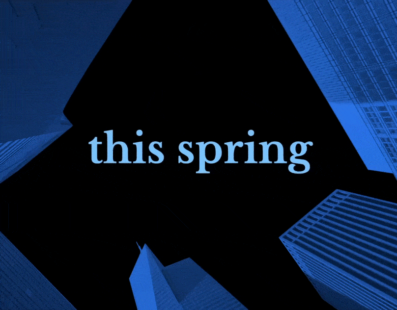
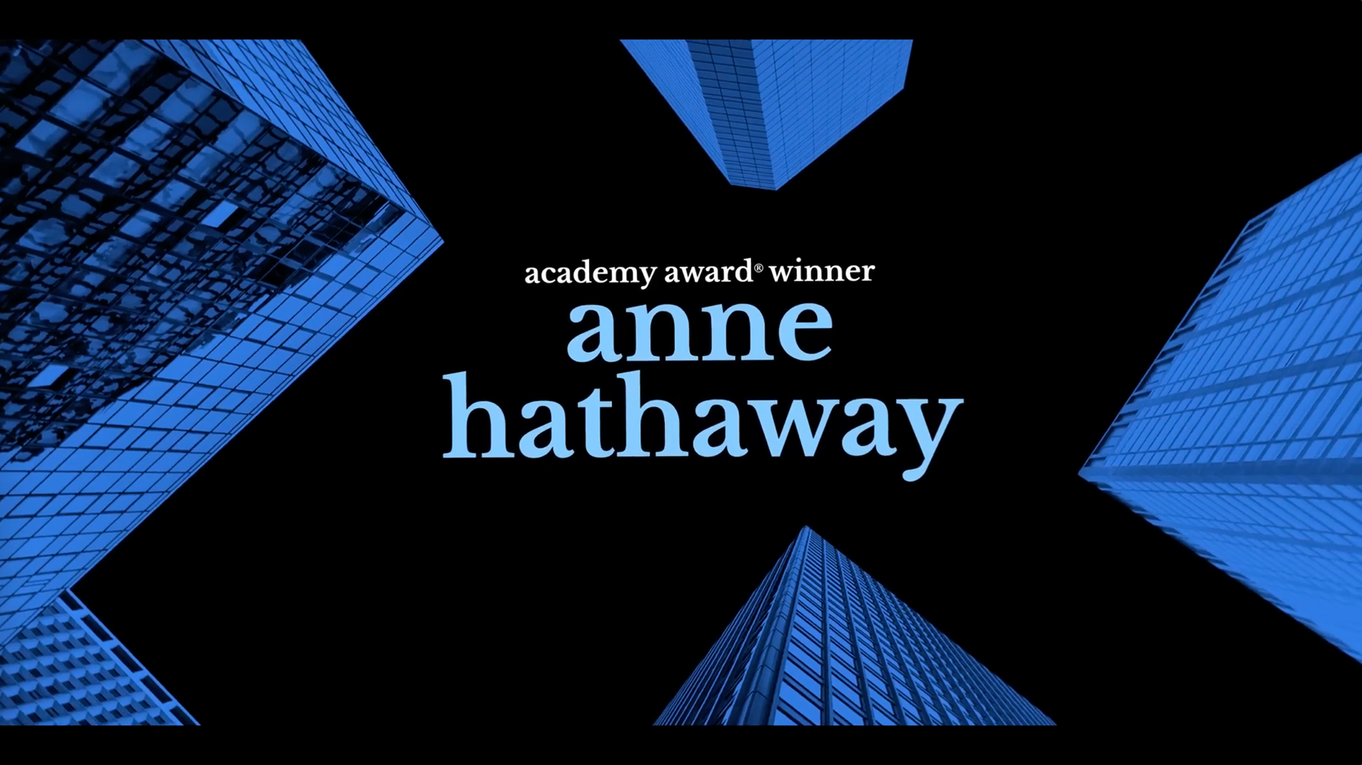
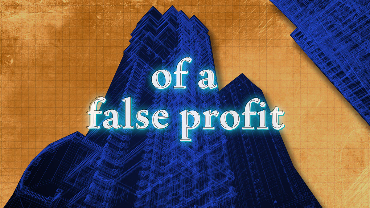
The visual direction for this campaign initially centered around themes of chaos and wealth. However, through deeper exploration, I found that the heart of the story was really about tension and perception. This led to the final idea: an optical illusion of New York City buildings twisting and compressing as the credits push forward in the frame, visually representing the pressure and distortion at the center of the narrative.
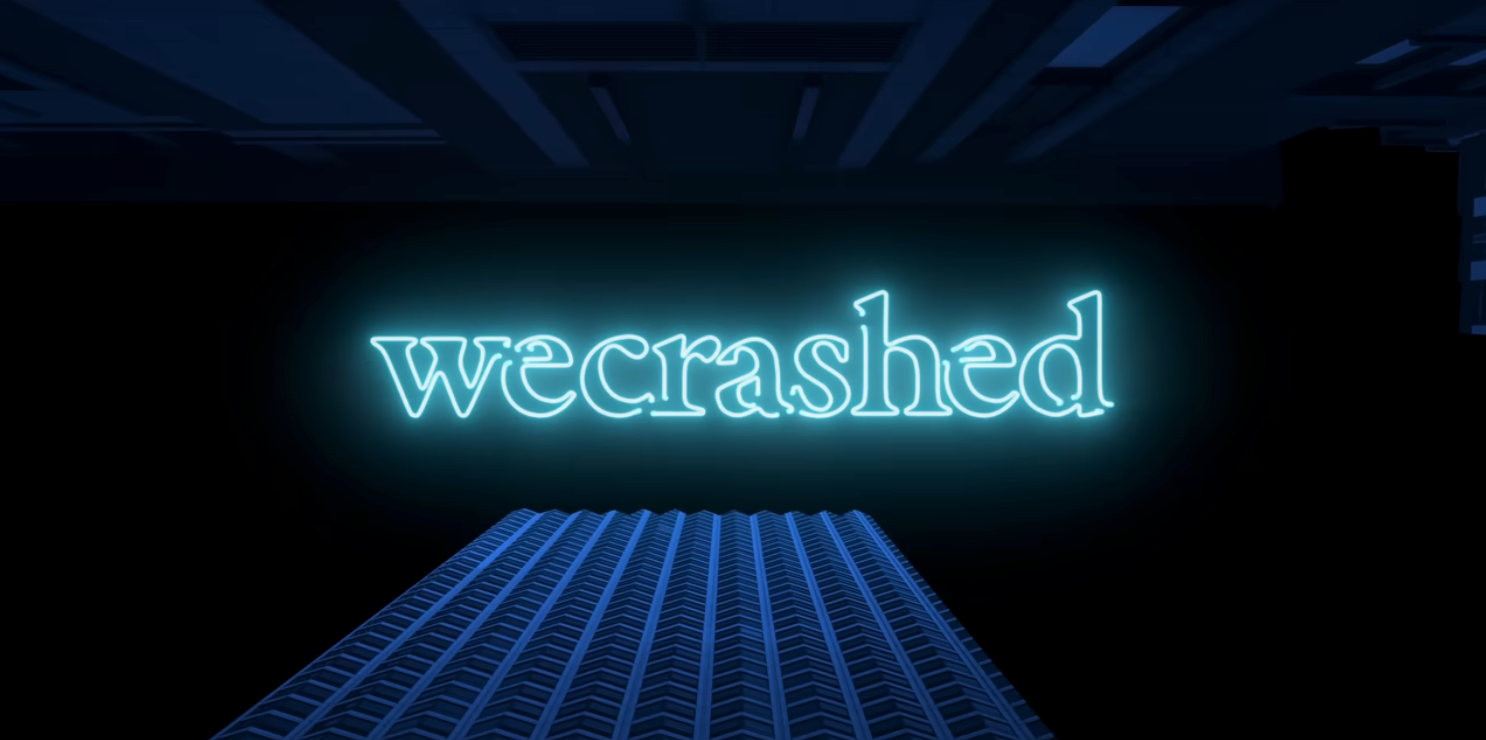
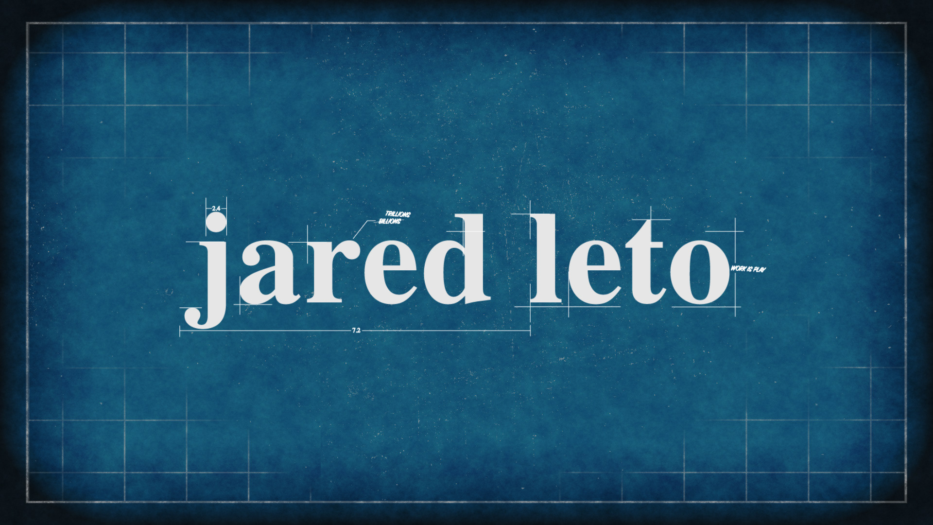
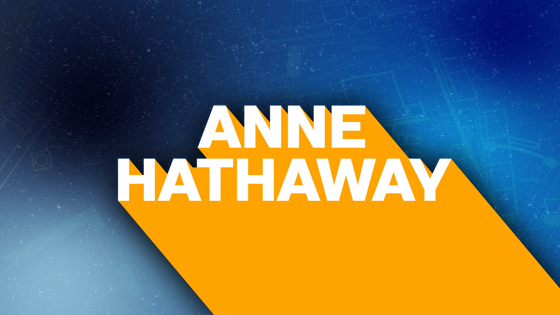
I served as the lead designer for the internal graphics cards used in the official trailer and teaser. The original series logo and opening title sequences were designed by Erin Sarofsky.
Concept Design:
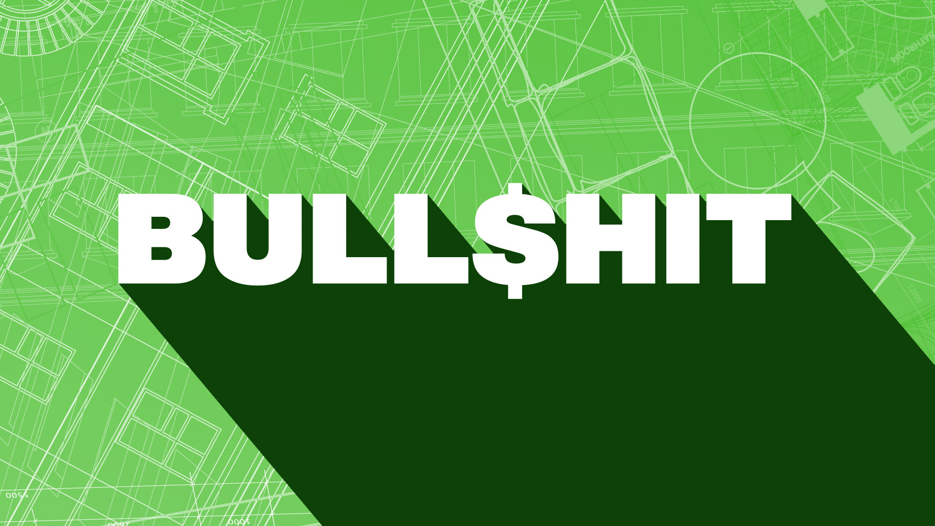
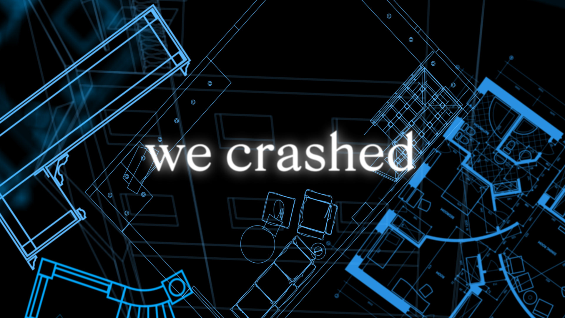
My initial instinct was images of the surfaces of WeWork; wall textures, floors, windows, and materials, but it didn't really tell the story of the show. Then I went in the other direction and thought more abstractly about chaos and dramatically falling down in a city that is closer to what we ended up with. The third concept, suggested by the client, was about the blueprint designs. I created many options, including using a parallax effect to zoom through the blueprints.
CLIENT: Apple TV+
MY ROLE: Art Direction, Motion Designer for teaser/trailer title cards
LOGO & SHOW TITLES: Erin Sarofsky
TYPE OF CLIENT: Agency / Tiny Hero