Forager Theatre Company is a small non-profit in New York that needed a logo reboot. I collaborated with their creative team to design a new look to market their brand, convey their message, and excite new members of the community.
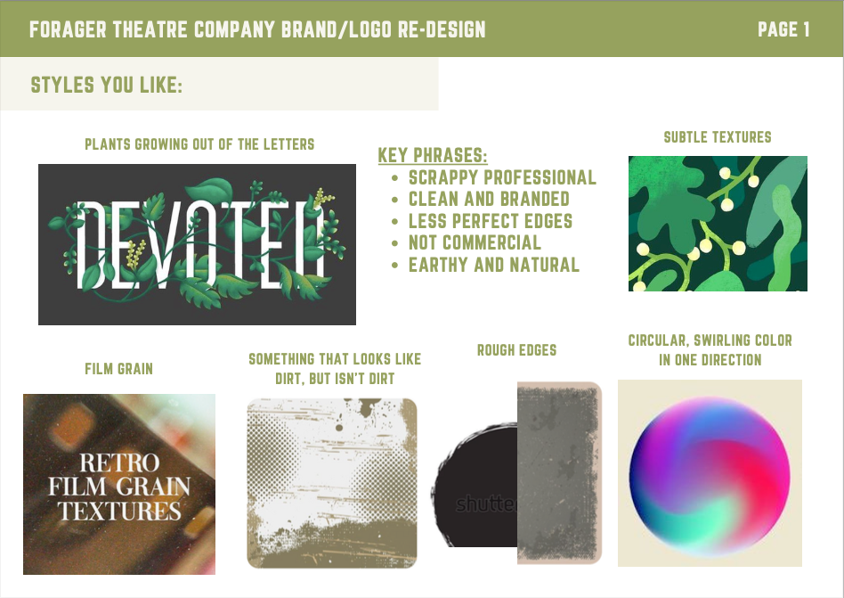
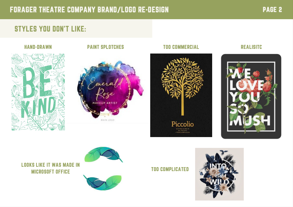
Concept Design Phase 1: The first part of my design process is creating mood boards and style frames in order to find a creative direction that makes the client happy. The team at Forager not only knew what they wanted, but they also knew what they did not want. After the initial phone consultation, the first thing I did was visualize what they told me they wanted and didn't want:
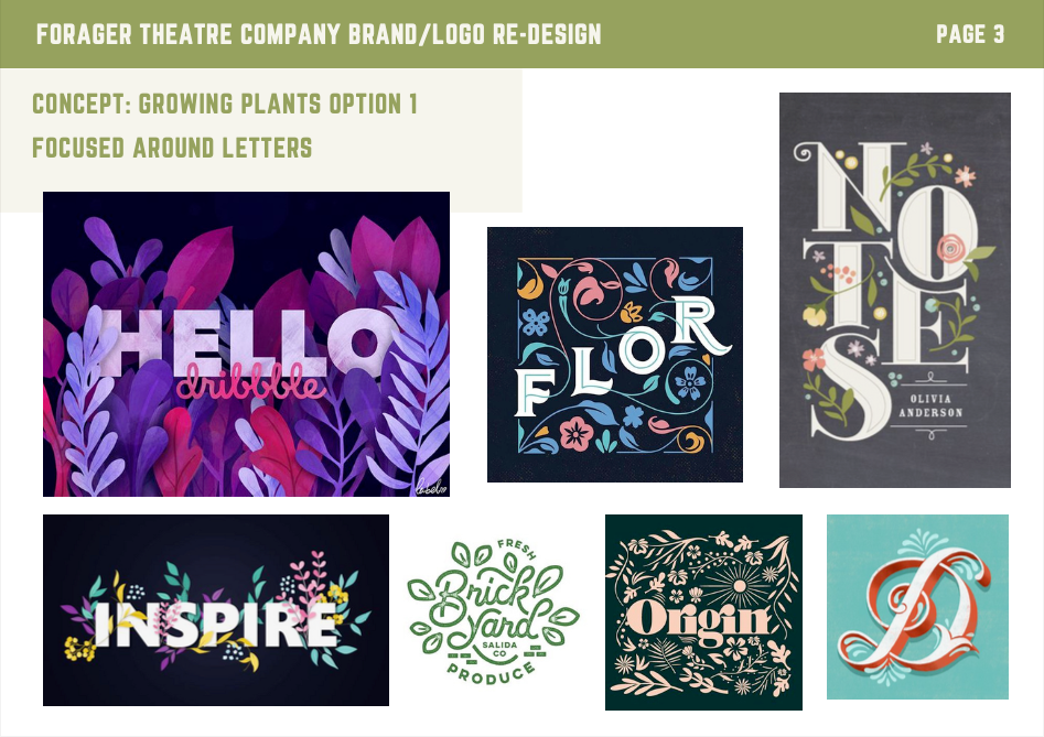
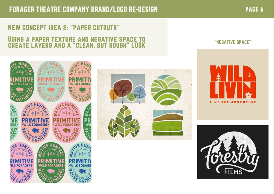
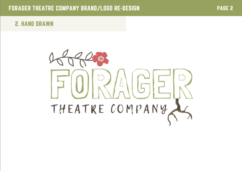
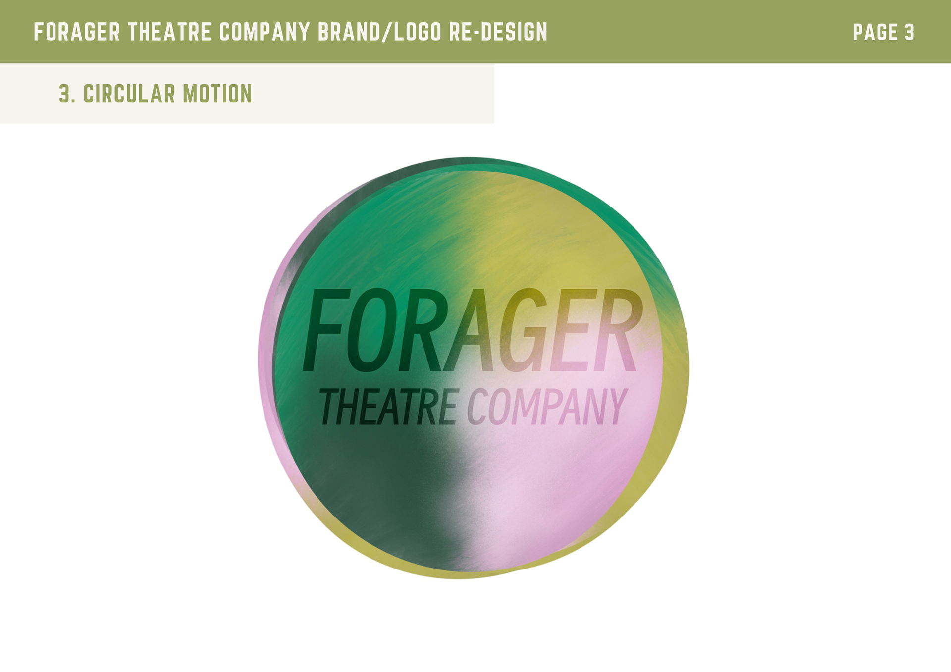
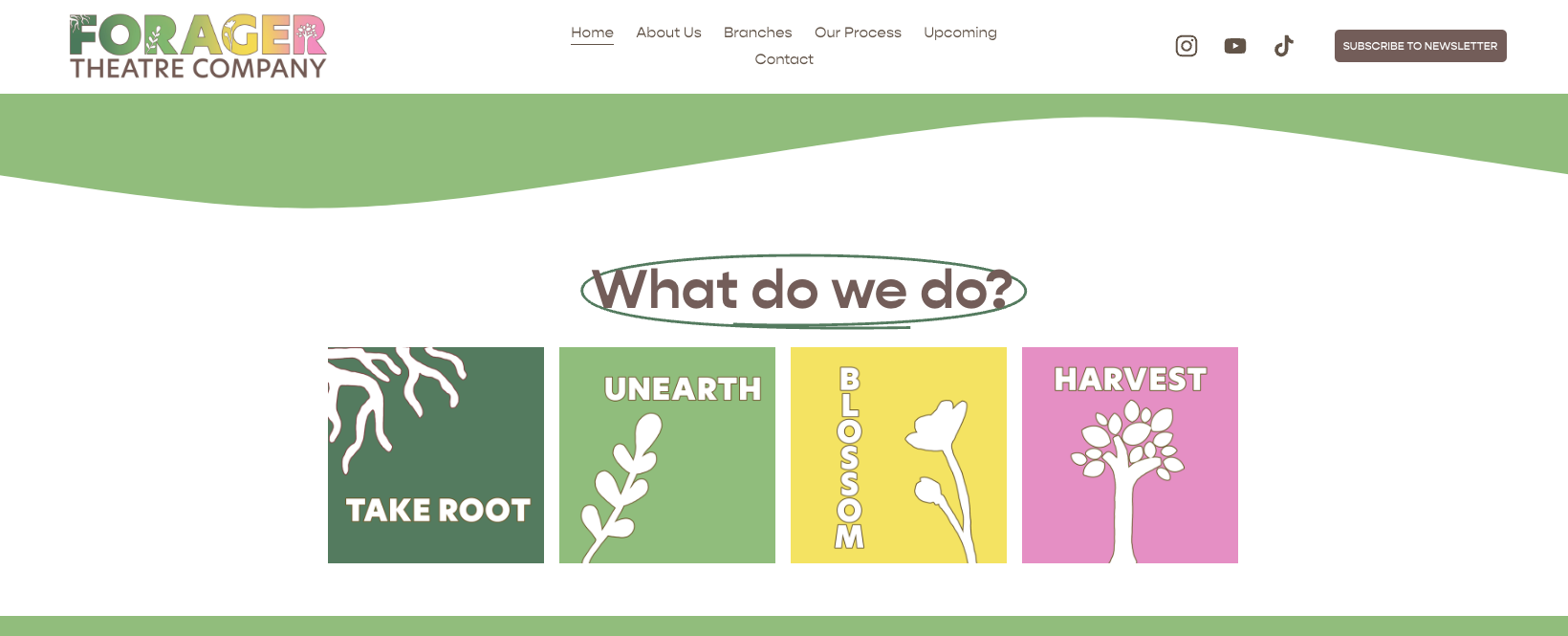
Concept Design Phase 2: The next phase was creating style directions that we could go in. Forager has a very literal title and format of how their theater company works, so it worked to go a little more literal on the design. The two concepts they ended up choosing was something to do with plants growing, and they really liked the idea (on the right) of using negative space.
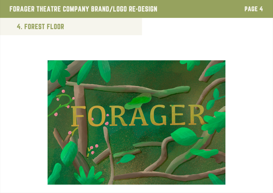
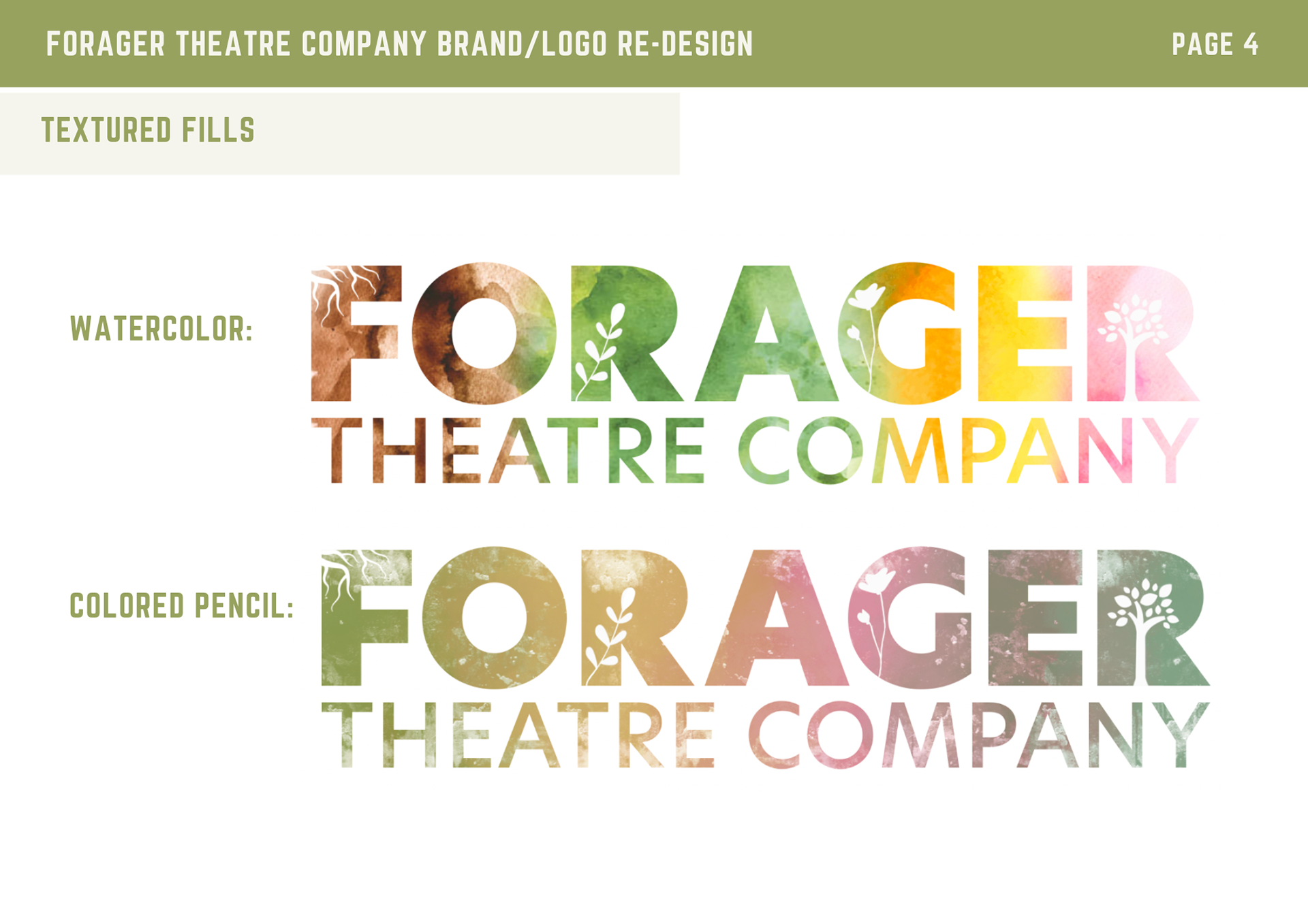
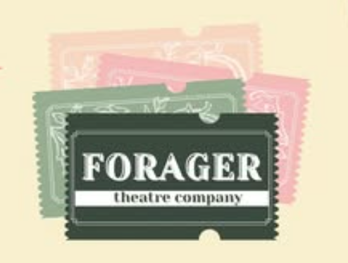
Concept Design Phase 3: After choosing a direction, I explored several logo concepts. One early idea involved placing the name on a forest floor, represented by the Procreate painting on the top left. While the final design ended up being simpler, these explorations helped shape the final result.
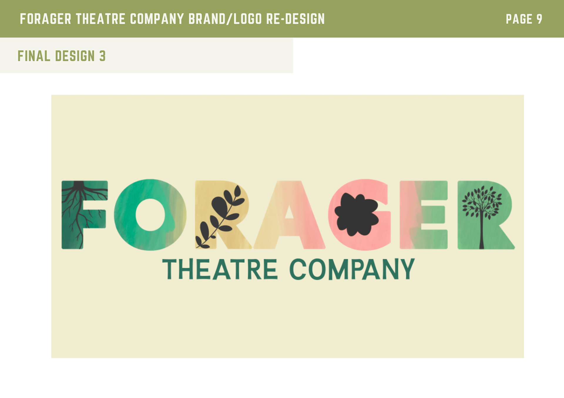
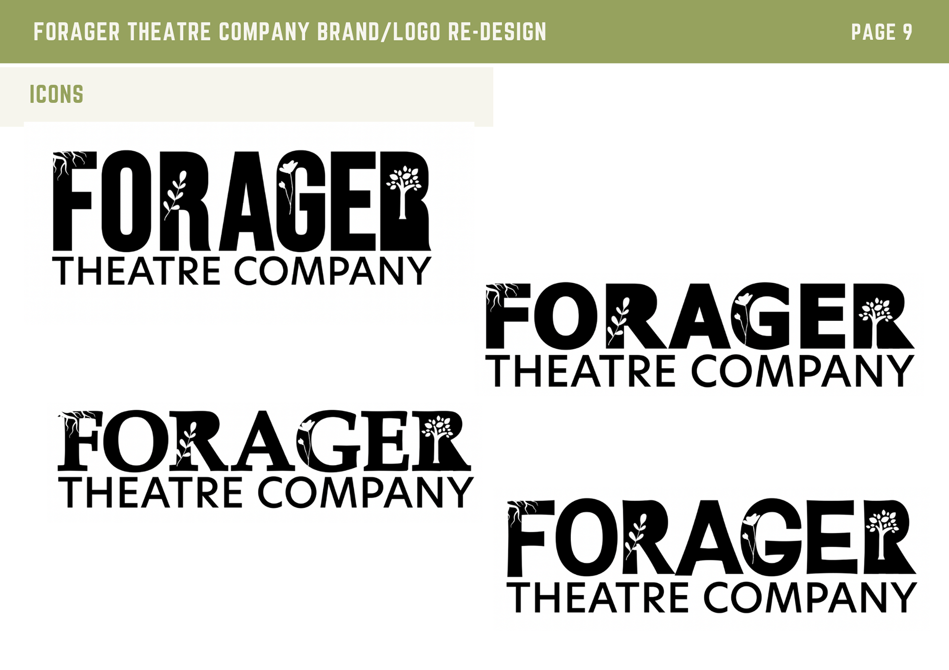
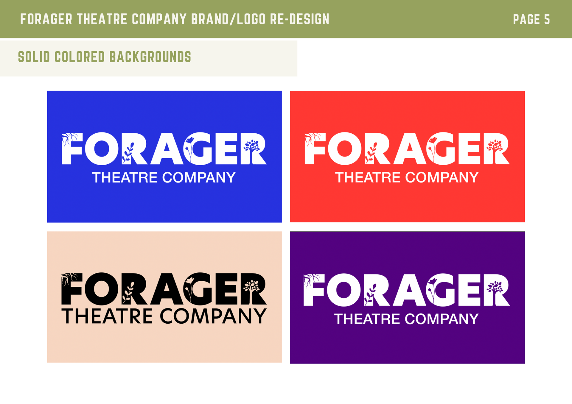
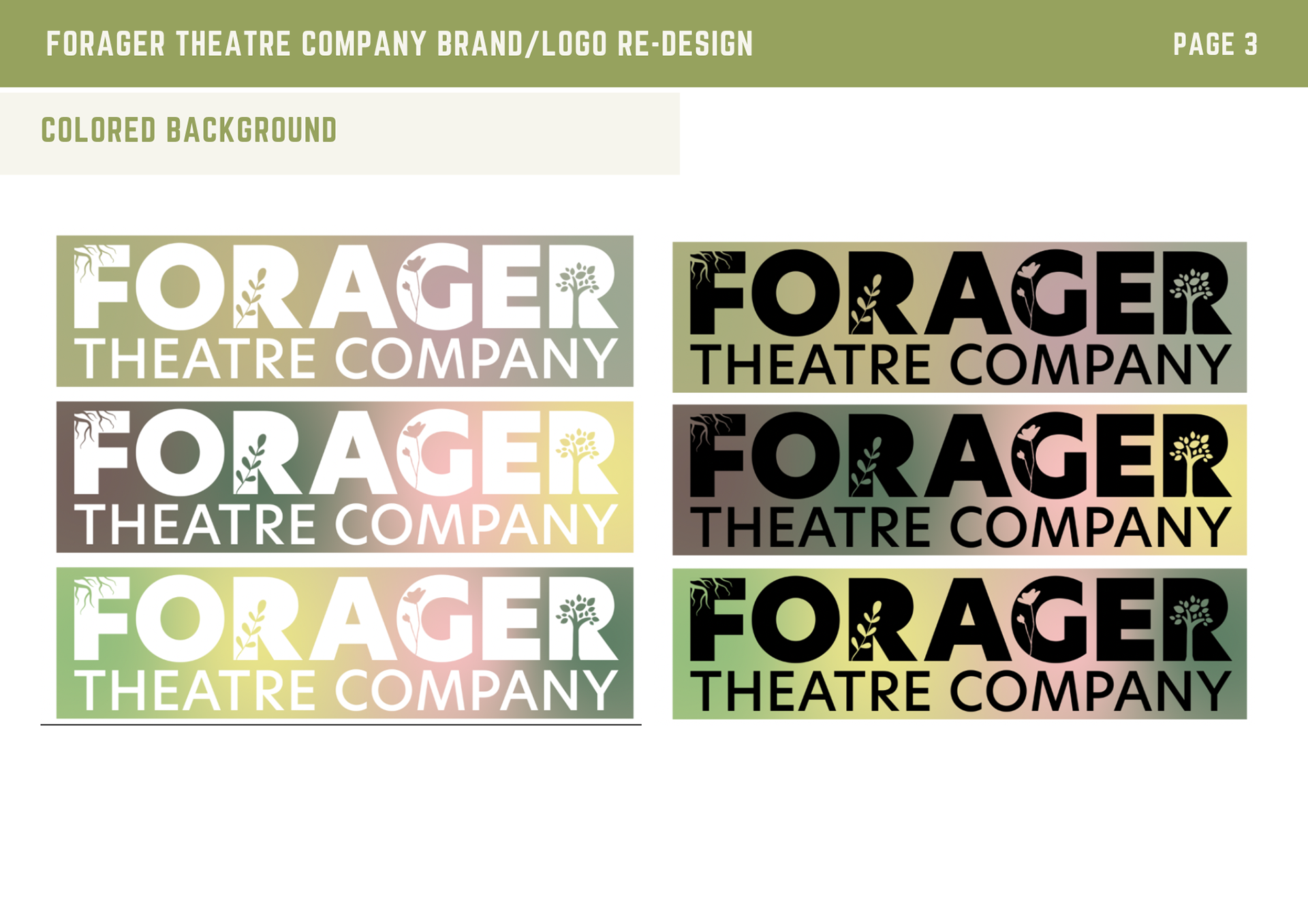
The final logo design: In the end, simplicity was key. A minimal color palette and use of negative space within the letters helped represent the theater company’s four branches. While the final result looks simple, it took weeks of iteration to reach this point. LEFT: The original logo. RIGHT: The new logo.


CLIENT: Forager Theatre Company
MY ROLE: Graphic Designer
CLIENT TYPE: Direct client
MAIN COLLABORATORS: Alex Parrish, Iris Rodrigo, and Jennie Hugues